Seven Graphs & Dashboards You Should See On How We Spend Our Time
Do workers in richer countries work shorter hours?
Although we share some similarities, such as eating, sleeping, and working, there are many differences in how we spend our time across the world. The following graphs visualise how we spend our leisure time and hopefully provide insights into the living conditions and well-being of the world.
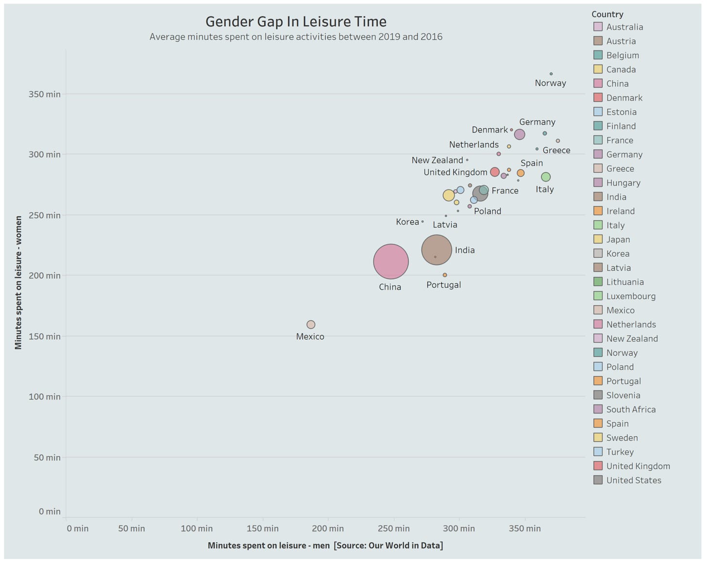
Is there a gender gap in leisure time?
From the graph, we can say that, on average, men have a higher leisure time than women. We can also see that the average leisure time for both men and women in the East is smaller than in most Northern European countries.
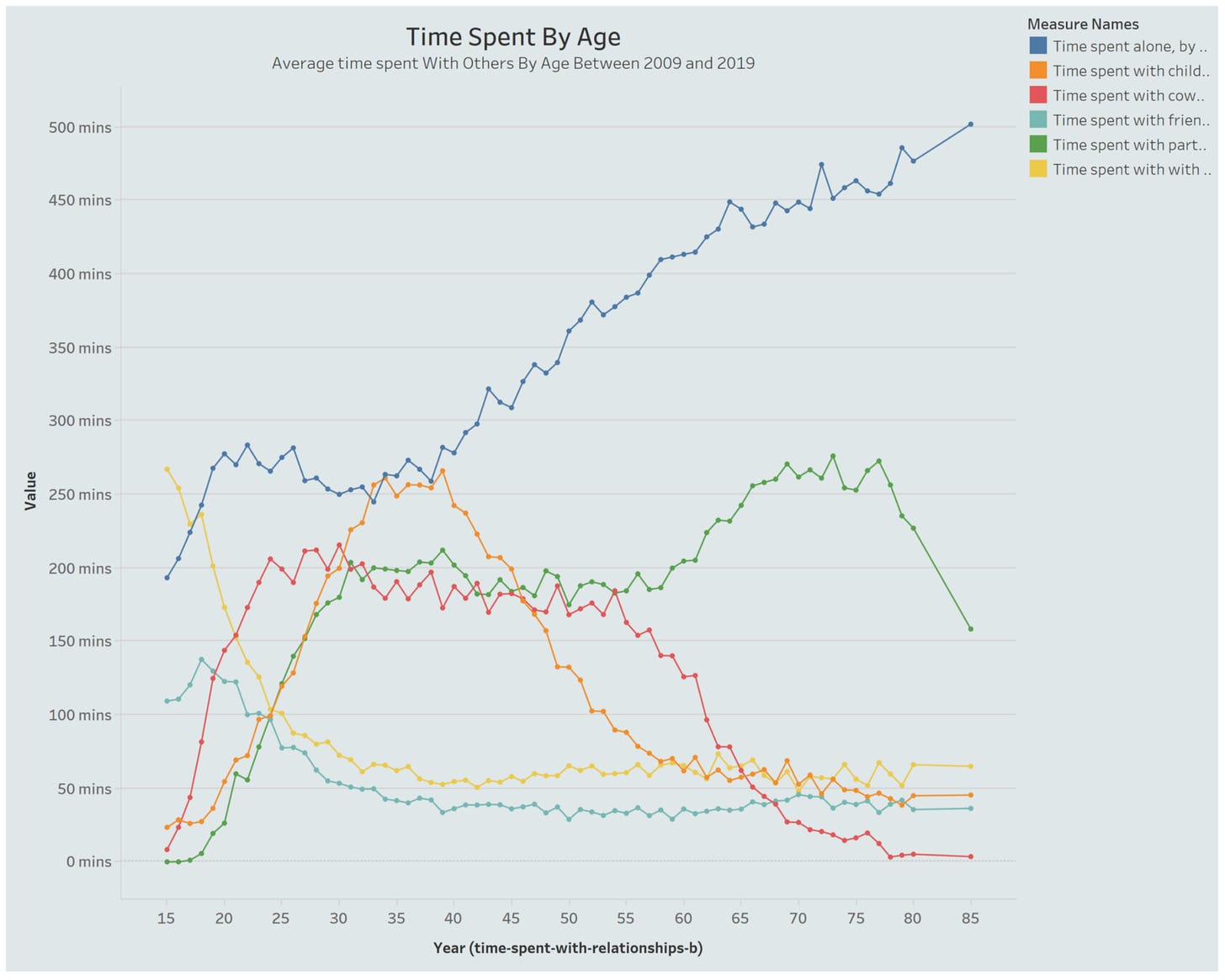
Who do we spend our time with?
On average, most people in America spend more time alone than with their families as they get older. Time spent with friends, parents, and siblings is relatively stable between 34 to 86. There is a steep decline in time spent with children from 39. And after 54, there is a decline in time spent with coworkers. This figure aligns with the average age of retirement in the US.
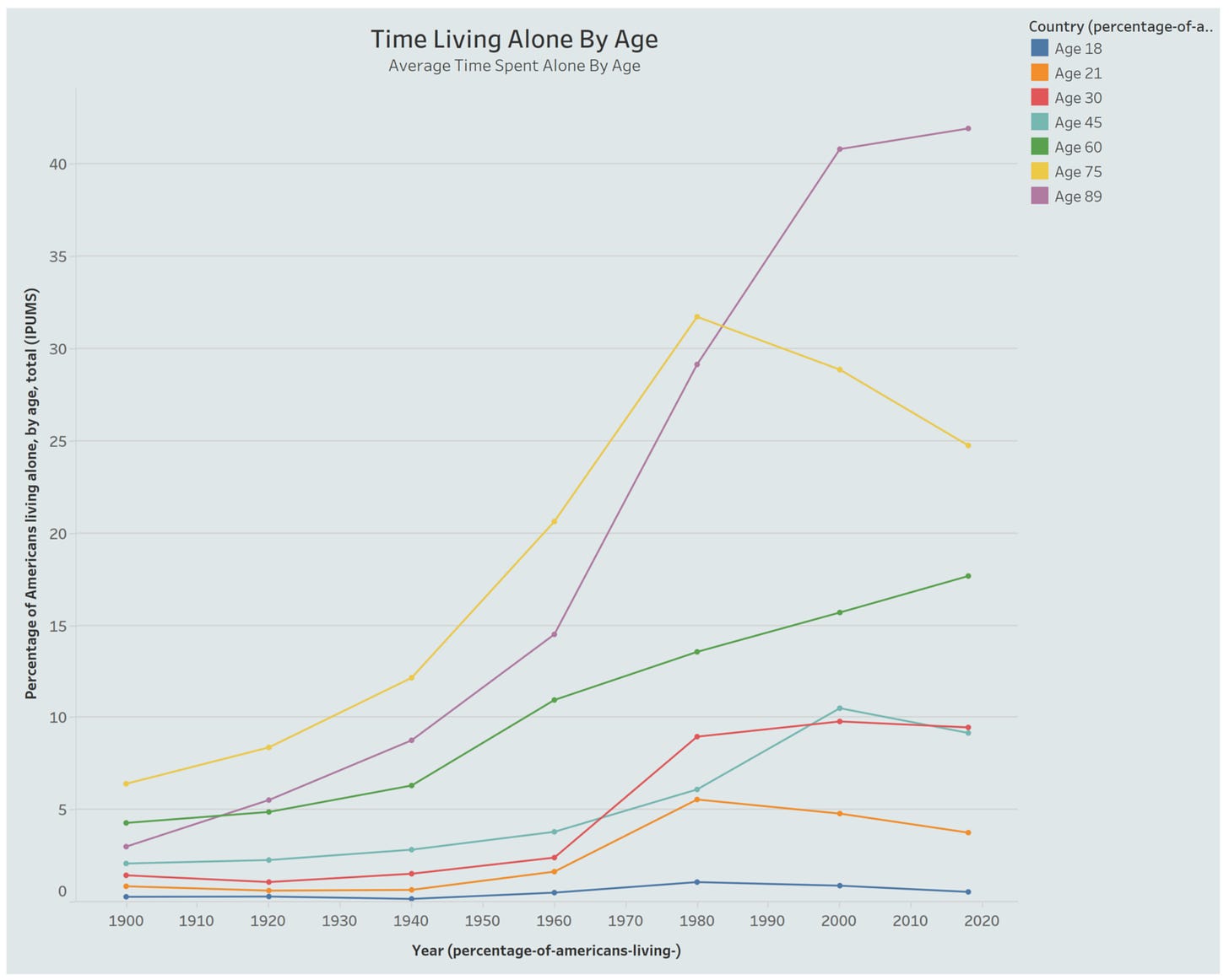
Do older people spend a lot of time alone?
From the 1940s, the number of people living alone increased from 21. There has been a massive increase in people over 89 living alone compared to those between 21 and 45 years old. After 1980, the number of people aged 75 upwards living alone decreased. This figure could indicate that between the age of 75 and 89, people living alone may have had a partner who died.
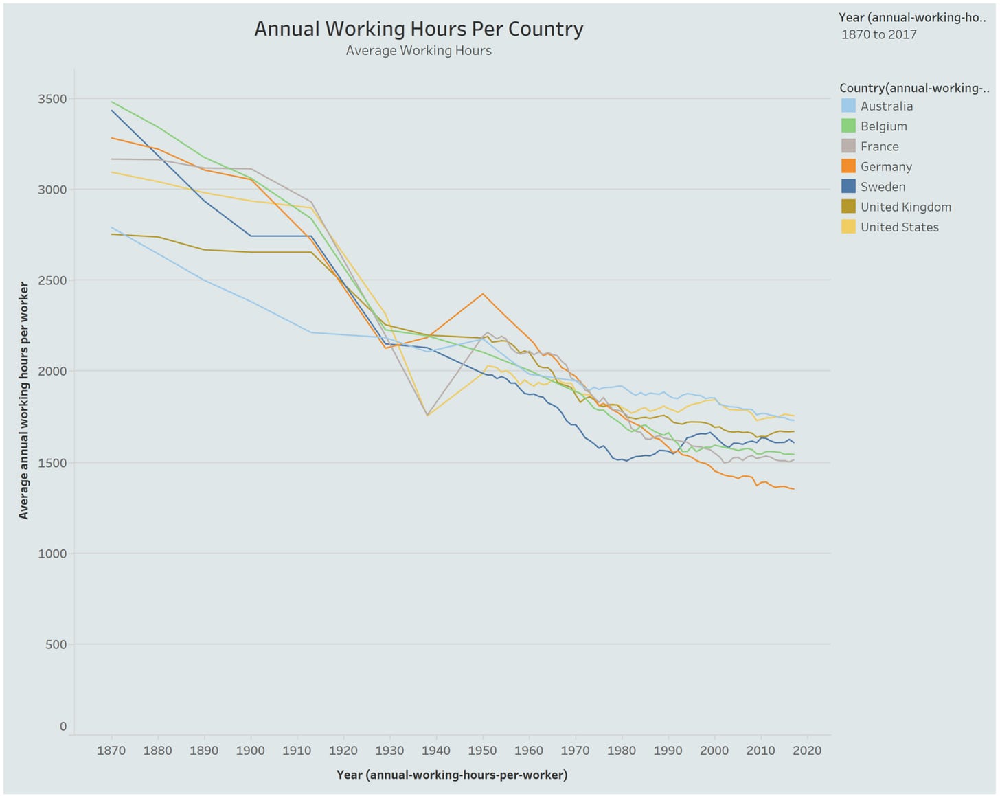
Are we working longer hours?
On average most countries have seen a steady decrease in working hours between 1865 and 2020. The United States, Germany, and France saw a sharp increase between 1938 and 1950. These dates coincide with World War Two.
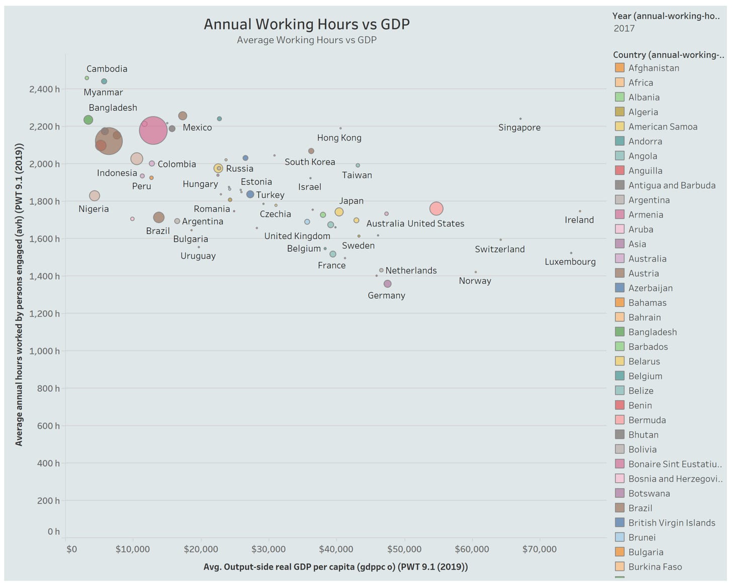
Are there differences between countries in working hours?
Cambodia and Myanmar have long working hours and lower GDPs than other countries. Switzerland has a higher GDP than those countries and fewer working hours.
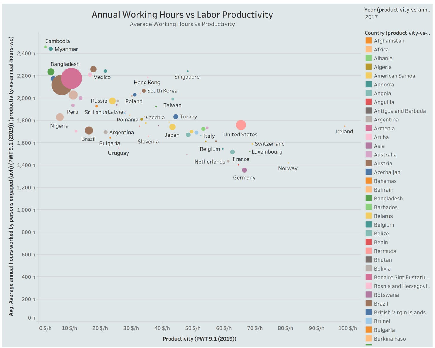
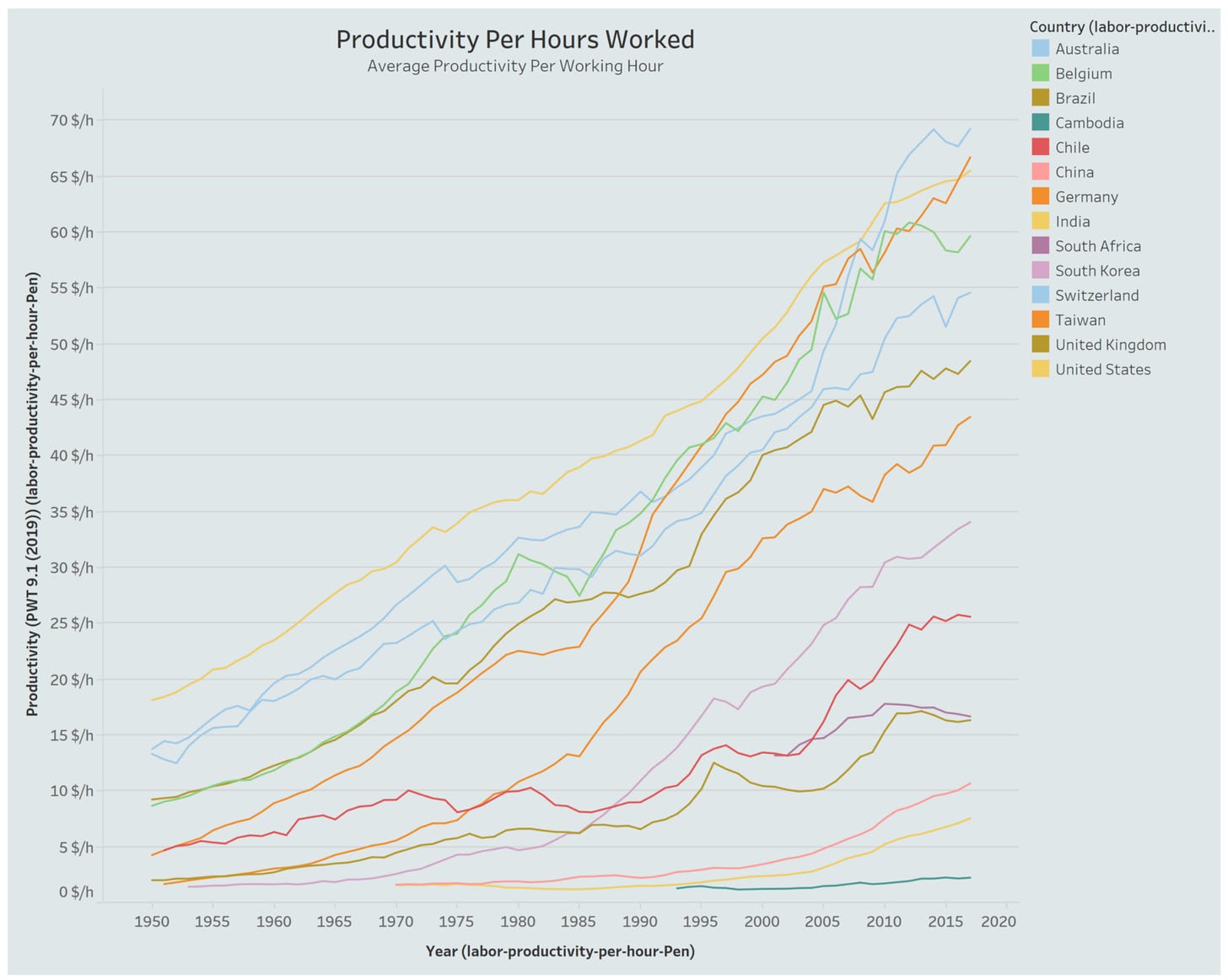
Is there a link between productivity, incomes, and working hours?
On average, there has been a steady increase in productivity between 1950 and 2020. China, India, and Cambodia have seen lower productivity levels per hour than other countries. Could this indicate a link between productivity, GDP, and working hours?
The complete project is available on my Gihub. If you like my article, please share it. Suggestions are welcome.
Thank you for reading this article.
#NeverStoplearning


